Web OS
Web OS
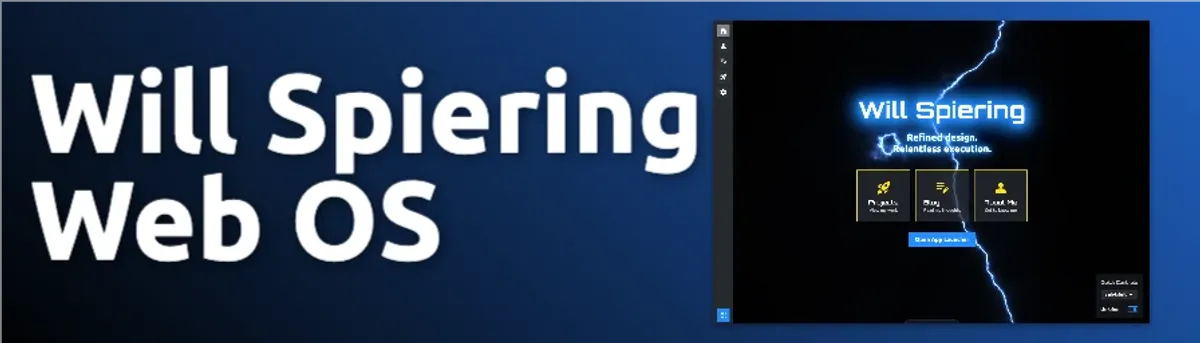
A web-based operating system interface built with Astro 5, React, and DaisyUI. This portfolio reimagines the browser as a desktop environment — complete with a dock, command palette, windowed apps, a WebGL lightning background, and a full theme and settings system.
Key Features
- WebGL lightning background with adaptive quality and theme-synced color
- 35+ DaisyUI themes with live preview and OKLCH color extraction
- Cmd+K command palette with fuzzy search, recent commands, and usage-boosted ranking
- Configurable dock (position, button style, active states)
- Quick settings panel (theme, dock, fonts)
- Global notification toast system with dock-aware positioning
- Keyboard shortcuts manager with ? help dialog
- Cookie-based settings persistence — no flash on load
- Plugin and command registry architecture
- Astro View Transitions for smooth page navigation
Project Progress
This is my personal portfolio, built as a fully interactive web-based operating system. Instead of a traditional scrolling page, visitors land on a desktop environment — complete with a dock, windowed applications, a command palette, and a live theme system. At 95% complete, the core experience is polished and the remaining work is focused on expanding the app library.
Overview
Web OS replaces the conventional portfolio format with a familiar desktop metaphor. Navigation happens through a configurable dock, a Raycast-style command palette, and dedicated app windows — all running in the browser with no backend required. The goal is a portfolio that is itself a demonstration of what I can build.
Technical Architecture
Core Technologies
- Astro 5: Static-site foundation with Islands Architecture — zero JavaScript shipped by default, hydrated only where needed
- React 18: Used exclusively for interactive islands (
CommandPalette,QuickSettings) viaclient:only="react" - TypeScript: End-to-end type safety across components, utilities, and content collections
- Tailwind CSS 4 + DaisyUI 5: Utility-first styling with a themeable component layer; all 35+ themes come from DaisyUI’s OKLCH color system
- Iconify: Icon library via
@iconify/reactandastro-icon, covering Material Symbols and Simple Icons sets - Astro View Transitions: Smooth client-side navigation; persistent components (dock, topbar) survive page transitions via
transition:persist
Layout System
Four layouts cover every page type:
| Layout | Purpose |
|---|---|
BaseLayout | Foundation — injects settings script, topbar, dock, command palette, notifications |
MainLayout | Standard content pages with a header and breadcrumb topbar |
AppWindowLayout | Windowed application chrome with title bar and close button |
FullPageLayout | Full-viewport experiences (e.g. the desktop itself) |
Configuration System
Behavior is driven by config files rather than hardcoded values:
src/config/site.ts— site metadata and available themessrc/config/dock.ts— dock items and navigation targetssrc/config/apps.ts— registered applications (Calculator, Calendar)src/config/commands.ts— built-in command palette commandssrc/config/defaults.ts— default settings values
Key Features
Lightning Background
The desktop background is a WebGL animated lightning effect (Lightning.tsx) with several production-quality details:
- Adaptive quality tiers (high / medium / low) selected based on device capabilities
- Frame-rate throttling and rendering paused when the browser tab is hidden
- Respects
prefers-reduced-motion— disables animation for users who request it - Theme-synced hue: extracts the primary OKLCH color from the active DaisyUI theme and maps it to the lightning color in real time
Theme System
With 35+ DaisyUI themes, users can:
- Switch themes instantly via the command palette or quick settings panel
- Preview any theme live before applying (theme browser mode in the command palette)
- Have their preference persisted in a cookie and applied before the first render — eliminating any flash of unstyled content
- Enjoy automatic lightning hue synchronization with the active theme’s primary color (via OKLCH parsing with multiple fallback strategies)
Command Palette
A Raycast-inspired command palette (CommandPalette.tsx) activated with Cmd/Ctrl + K:
- Fuzzy search with relevance scoring across all commands, navigation targets, and apps
- Recent commands tracked in
localStorageand boosted in search ranking by usage frequency - Full keyboard navigation (arrow keys,
Enter,Escape) - Theme browser mode with live preview directly from the palette
- Command categories: navigation, apps, actions, settings/themes
- Extensible via the command registry — new commands can be registered at any point
Dock
A configurable dock (Dock.astro) with items defined in src/config/dock.ts:
- Items: Home, About Me, Blog, Projects, Contact, Settings
- Position: left, right, top, or bottom — user-configurable and persisted
- Button style: ghost, outline, or soft
- Tooltip positioning adapts to dock location
- Active state highlighting for the current page
Quick Settings Panel
The QuickSettings.tsx panel provides fast access to the most common preferences:
- Theme selector (full list with live switching)
- Dock position and button style controls
- Font selectors for standout and body fonts
- Quick action buttons: open keyboard shortcuts, clear recent commands
Notification System
A global toast notification system (NotificationToast.astro) available to any component or page:
- Call via
window.showNotification({ type, message, duration, action }) - Types: info, success, warning, error
- Auto-dismisses after a configurable duration
- Supports optional action buttons
- Positioning is dock-aware — toasts appear on the opposite side of the screen from the dock
Keyboard Shortcuts
A global shortcuts manager (ShortcutsHelp.astro) with a built-in help dialog:
- Press
?anywhere to open the shortcuts reference Cmd/Ctrl + K— command paletteCmd/Ctrl + ,— quick settingsCmd/Ctrl + H— homeCmd/Ctrl + Shift + P— projects
Plugin and Command Registry
The command registry (src/utils/command-registry.ts) and plugin system (src/plugins/registry.ts) provide an extensible foundation using a module-scoped functional pattern:
- Commands registered with category, priority, keywords, and handler
- Fuzzy search index built at registration time
- Plugin hooks for: command registration, keyboard shortcut registration, context menu registration, notification handlers
- No global classes — uses module-scoped
Mapand pure function exports
State Management
Settings are managed through a centralized utility rather than an external state library:
src/utils/settings-manager.tsis the single API for reading and writing all settings- Values are stored in a
site-settingscookie viasrc/utils/cookies.ts - An inline
<script>inBaseLayoutapplies settings synchronously before the page renders, preventing any flash - React component state uses
useState/useEffectfor local UI interactions - Cross-component communication uses custom DOM events
Styling Approach
- Tailwind CSS 4 for utility-first layout and spacing
- DaisyUI 5 for component primitives (buttons, modals, dropdowns, badges)
- Custom CSS for unique interactions (lightning sizing, dock transitions)
- Native
<dialog>elements for accessible modals
Challenges Overcome
- No-flash settings application: Persisting user preferences (theme, dock position, fonts) and applying them before the first paint required an inline synchronous script injected by
BaseLayout, reading from cookies before any framework hydration occurs. - WebGL adaptive quality: The lightning effect needed to work gracefully across a wide range of devices — from high-refresh-rate desktops to low-powered mobile browsers. A three-tier quality system (high/medium/low) with automatic detection was built to handle this.
- OKLCH theme color extraction: DaisyUI 5 uses OKLCH color values. Extracting the hue channel to sync the lightning color required parsing CSS custom properties with multiple fallback strategies, since computed styles expose values differently across browsers.
- Astro + React hybrid hydration: Mixing Astro’s static rendering with
client:only="react"islands required careful design to avoid hydration mismatches and ensure the command palette and quick settings panel are available on every page without re-mounting unnecessarily.
Future Enhancements
- Multi-desktop support (virtual desktops)
- Window snapping and tiling
- Expanded app library
- File system metaphor for organizing projects
Design Philosophy
The design centers around familiarity and delight. Using interface patterns people already know — desktop, windows, dock — reduces cognitive load, while the WebGL background, smooth transitions, and live theming add personality that a standard portfolio page cannot.
Conclusion
Web OS is 95% complete. The core desktop experience, theming system, command palette, notification system, and layout architecture are all production-ready. The remaining work is expanding the built-in app library and refining a few edge cases. It is both a portfolio and a direct demonstration of the kind of creative, detail-oriented frontend work I enjoy building.