UI Toolkit
UI Toolkit
A React component library built on top of Fluent UI for Microsoft 365 and SharePoint, created to cover gaps in the open-source components and support more complex application needs and improved developer experience.
Key Features
- We owned the component library and could make changes to it as needed
- Developer playground to build and test new components
- We began adding in more and more components we were repeatedly building for our projects
- Improved developer experience, and increased productivity allowing us to reuse components across projects
Project Progress
Overview
UI Toolkit was created to formalize and improve the components we found ourselves rebuilding across projects and client work. We refined what was already working and built our own layer on top of Fluent UI to fill real gaps and improve flexibility.
We also built a dedicated playground environment for the library, which allowed us to design, build, and test components in isolation before ever touching client project code. If something worked well there, we knew it was solid. If a component proved especially useful, we could promote it directly into the toolkit for reuse across future applications.
It was intentionally small but highly impactful. By introducing reusable primitives, shared hooks, and more robust component patterns, we significantly improved developer experience, consistency, and overall productivity.
Technical Details
Architecture
- Frontend: React, TypeScript, Styled Components, SharePoint Framework (SPFx), Fluent UI React
- Deployment: SharePoint Online
Features
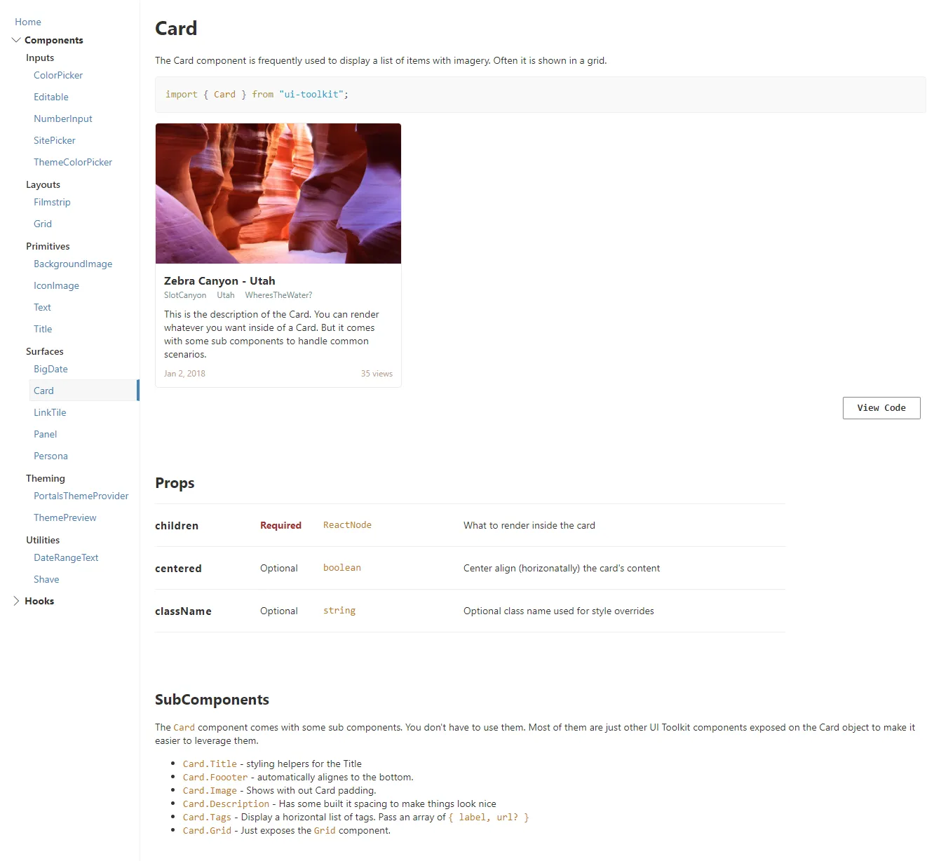
Feature 1: Card
At the time, Fluent UI did not include a card component, and we were using cards everywhere. We made our own really flexible card component that was highly configurable, easy to customize, and could work in almost any scenario.
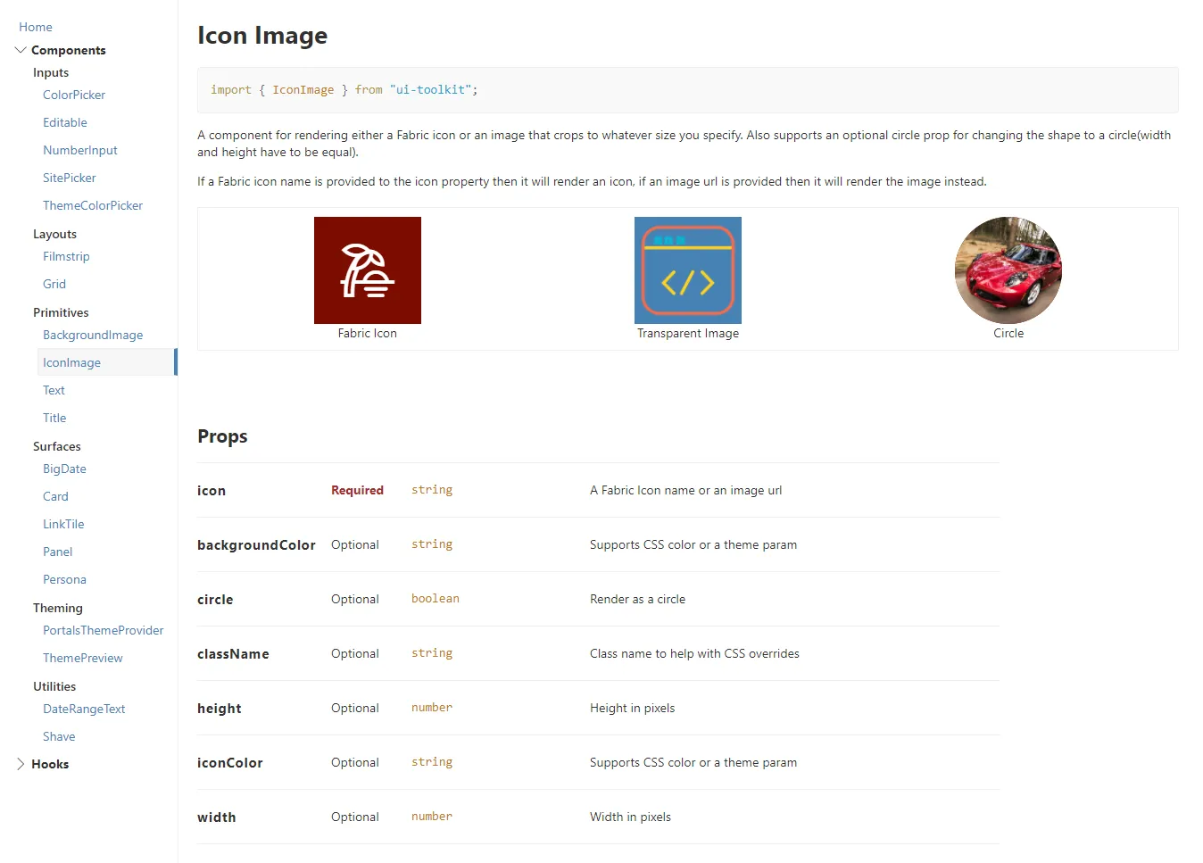
Feature 2: Icon Image Component
A flexible component that renders either a Fabric icon or an image, cropped to a specified size. It supports an optional circle prop to render the content in a circular shape. If an icon name is provided, it renders the Fabric icon; if an image is provided, it renders the image instead.
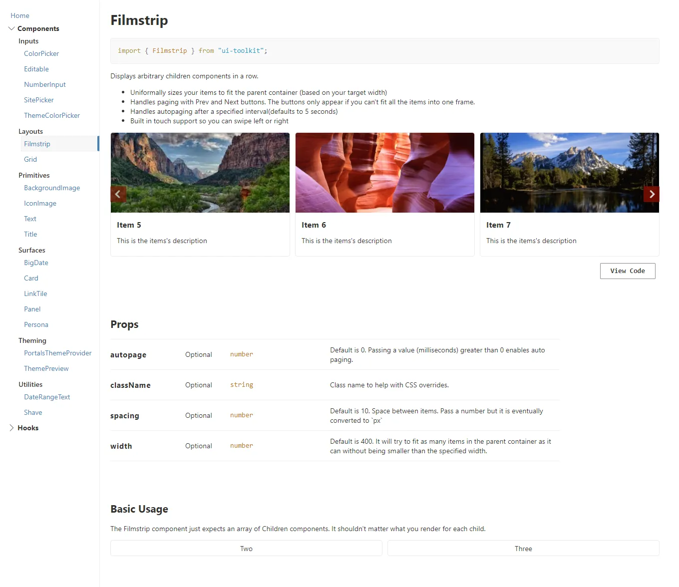
Feature 3: Filmstrip Component
The Filmstrip renders arbitrary child components in a horizontal row and uniformly sizes them to fit the parent container based on a target width.
It supports paging with previous and next controls that only appear when all items cannot fit within a single frame. It also includes auto-paging and built-in touch support, allowing users to swipe left and right with expected mobile behavior.
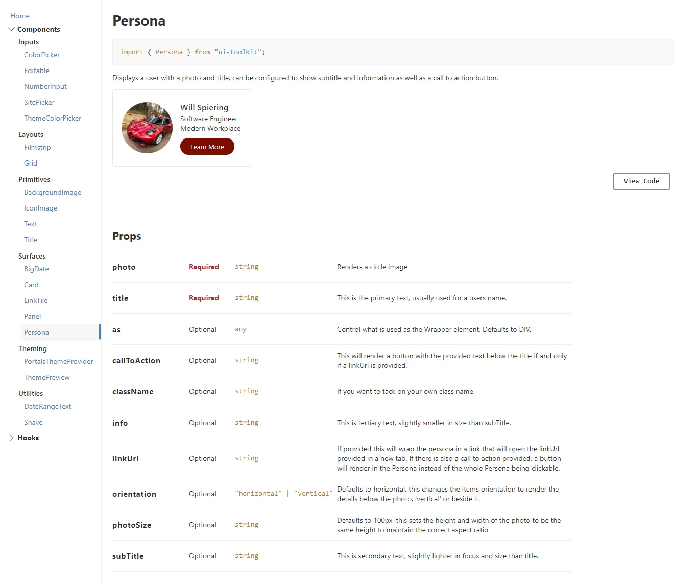
Feature 4: Persona Component
A flexible Persona component that displays a user’s photo and title, with optional subtitle, details, and a call-to-action button. We built it to simplify and streamline what Fluent UI made overly complex, giving us easier control over layout, orientation, and behavior without the extra overhead.
`
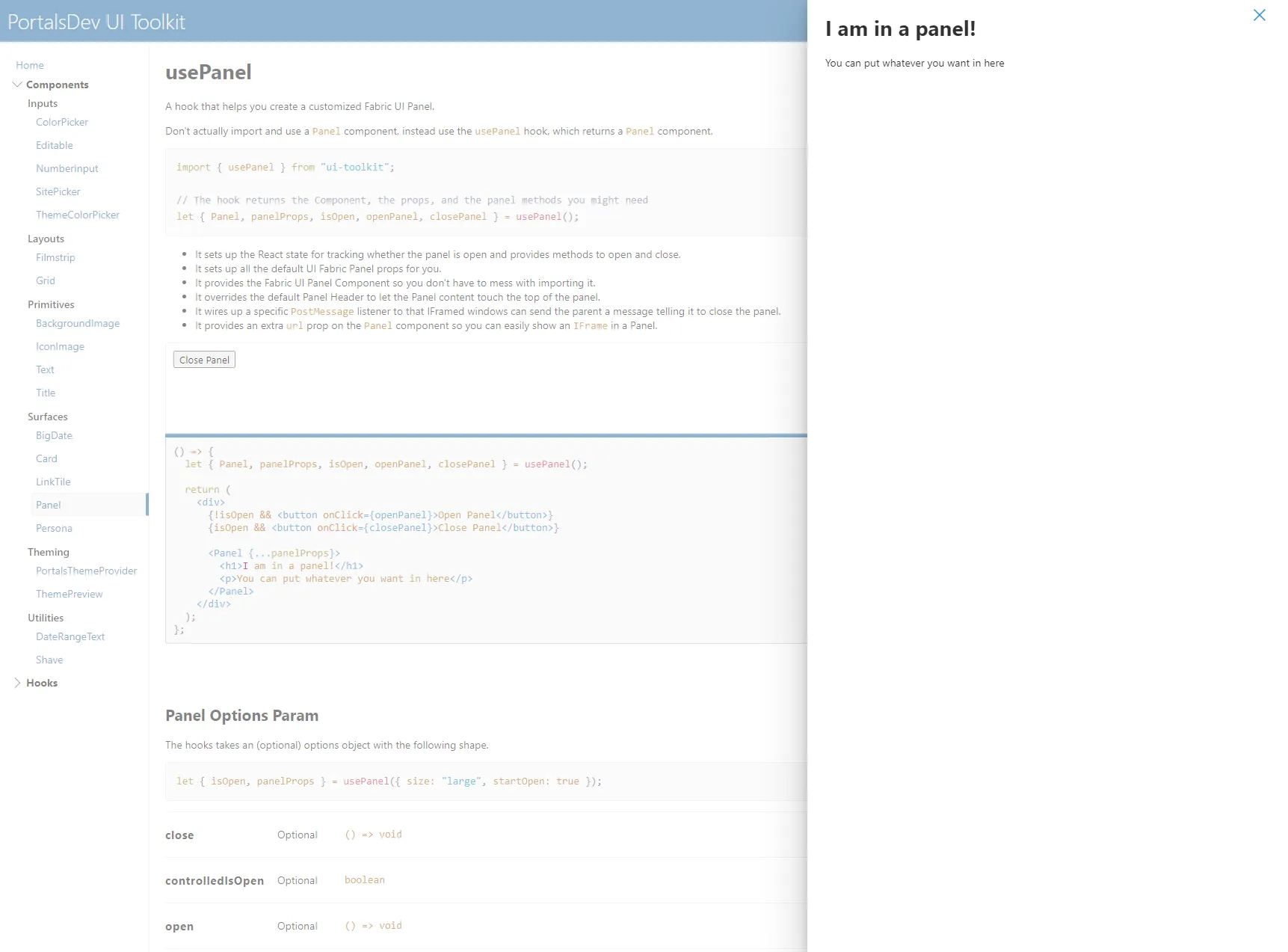
Feature 5: Panel Hook
A custom usePanel hook designed to streamline the creation of Fluent UI panels. It manages open state, supports programmatic closing, provides sensible defaults with easy overrides, and allows custom header and footer content. It also supports rendering an iframe via a URL prop, expanding the panel’s flexibility and use cases.
Development Process
Lessons Learned
It was a valuable learning experience because we were using the tool daily while actively improving it. We were essentially building the tool while relying on it, which forced us to think in terms of reusability and long-term value instead of one-off solutions.
That mindset shifted how we approached development. When we found ourselves repeating patterns that worked, we refined them into proper components and moved them into the library. Nothing was wasted; it either improved the current build or became something reusable for the next one.
Conclusion
This was my first real exposure to building a reusable library, and it shaped how I approach development to this day. I carried those lessons into future roles, where I continued building reusable components and, when needed, full design systems tailored to specific clients and branding.
It was an invaluable experience and a foundational shift in how I think about scalable front-end architecture.